About Beacon
After the pandemic hit, our social life has never been the same again. To fight the loneliness, Beacon App is born. Throwing a party? Don’t know where to have fun in NYC? Leave the hassle behind with Beacon! Beacon App is a social-planning app that helps party animals throw their events and parties easier than ever.
In this case study, I’m going to feature one of my projects that I’m working on at Beacon App - Chat function.
Project timeline
On-going
My roles
Product Designer
Tools
Figma
Our target audience
Our target market is New York City and people who are:
Above 18 years old
Party planners
Outgoing people who love hanging out with friends
People who want to explore NYC
People who got affected by the pandemic and would like to change their lifestyle
How can we integrate a chat function that can improve and bring the convenience to the communication between the hosts and invitees?
For users who create events, especially the big ones which could have more than 20 people, on Beacon App, they want to have all the communications in the same place so they can quickly and easily access and respond.
Goals & expectations:
Create a chat button on the event screen
Create a full screen for group chat
Users could swipe between the chat and announcement pages
Host can make announcements quickly while chatting
Reuse the already built-in components for this feature for the developer’s convenience
The UI must be consistent with the app’s branding and design system
Starting screens
Where I am going to integrate the chat function
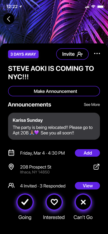
Event page in host’s view (with an without announcement)

Event page in invitee’s view (with and without announcement)


The first step, also the first challenge, is I need to figure out where would be the best place to insert the Chat function without creating a dramatic change to the current layout. It took me several attempts before we all agree to the final direction.
The first solution

We were testing our first solution about swiping between the chat and the event page for users’ convenience. My goal is to make the information in this feature as clear as possible by including the name and profile icon in every text bubble . A list of people who are going to this event is placed on top of the chat. Sending images is also a potential idea for this function.
To demonstrate my idea better, I created a quick prototype and present it to my team and the developers.
However…..
After discussing with my team, the first version didn’t work out because:
There would be a very limited room for the conversation since the image and invite list was taking 1/3 of the screen
Unusual layout could cause users confusion
This layout would be a challenge for our developers to build
Iterations for the second version

1 (Winner)

2

3
We picked option 1 as our winner because:
(2) was also a nice placement but we want to leave some space for the banner because it could contain information depend on users’ choice of image. Having the chat button there would cover a part of the image.
(3) placing it next to the announcement button wasn’t favored because it would create the inconsistency between the host and invitee’s screen. For developers, it is also more challenge to build.
I changed my direction per the feedback received from my design team; instead of swiping between pages, I created a chat button which would lead to the page. I made different variations where the button could be potentially placed, then submitted for feedback again.
While presenting them to the team, I shared that (1) and (2) were my top choices because the placement in option 1 doesn’t interfere with any other information on the page - option 2 was inspired by Facebook’s messenger which is also at the top right of the app. Option 3 is my another experiment.

My second version for the chat-announcement page
We all agree that the chat page should be full screen to give more room for the conversation and a list of announcement.
The initial purpose of swiping between announcement and chat is to provide convenience, especially for the hosts, to quickly post their important message separately from the chat. It works better than integrating it directly into the chat page because the announcement message will be flown away after multiple texts so there is a high chance that people would miss it. However, our team was still debating whether or not this swiping would make sense for the users.
Explore the group chat user interface
Understand the scope
I and the team did a quick research about the UI trends for the group chat page then discuss with CTO what we can do.
Our goal for this page is having a straightforward and simple design with clear information. Unlike some common group chat interface we have seen, we want our users to see people’s name and profile icon in each message they send because it’s going to be a big group of people.
Here are some of my attempts on the chat interface


The anatomy of text bubble

Final Design and User Flow
For the latest version, we decided to eliminate the swiping pages and separate the chat and announcement because users might be confused. Some potential questions could be: “Why there is announcement in my chat?”, “if I want to see or make announcement, should I go to chat or announcement button?”. To avoid that, we think this is the best solution for now.


Next steps
Continue working with design and engineer team to make the feature functional
Discuss with the team about what we should include under the kebab’s menu in the chat
Experiment with the announcement layout to make it match with the style in chat page
Create another version for web

Takeaways
Beacon App is a pre-seed startup so the scope for our projects is very small. Most of our designs are MVP that is adaptable to backend technology while meeting the design requirements. Our main focus is smooth user flows so we don’t prototype the flow at early phase until we finalize the flow. I learn how to simplify the complex problem, collaborate with developers and compromise for my design choices. I’m excited to see my designs on the actual app.
I usually create a quick prototype to present my idea with the team and show the developers how I expected the transition to work in real life