
FirstStop Mortgage
Redesign existing website
Project overview
FirstStop Mortgage was founded in 2020 in Bay Area, CA. Their mission is not only to make the mortgage process easier to buy a home, but also to offer customers the best rates available. Before launching, I was requested to design their branding identity, including logo, color palette, business card, Facebook cover, brochure, etc. and the secondary branding for their branch in Texas. In this project, I continue my freelancing work with them by redesigning their website.
Timeline
Ongoing
My role(s)
UX/UI Designer
Brand Designer
Design Consultant
Heuristic Evaluator
Collaborated with:
Thao Nguyen: CFO, Co-founder, SME
Tim Tran and David Ngo: Loan Processor, SME
Tan Tran: Web Developer
Project vision
FSM is expanding their business to South California, Texas, and Florida so this new website is a part of their marketing campaign. An updated website will help not only reinforce the consistency of their brand but also promote trustworthiness to the future clients.
4 key focus areas in this new design:
Improve the first impression from new customers
Improve the user experience of applying for loans and getting a custom rate
Improve the website’s responsiveness on different screens
Increase the website traffic

Empathize with our users
Who is using this website?

POTENTIAL CUSTOMERS
Who have never used this website before. Motivations: check mortgage rates, learn about company

LOAN PROCESSORS
Who work with the customers directly. Motivations: help customers check rates, show them how to use website, retrieve their information

CURRENT CUSTOMERS
who have experienced with this website at least once or used the company’s services before. Motivations: keep track of their loan application and check daily rates for refinancing
To learn more about the customers, I scheduled an interview with one of the loan processors who have handled over 60 cases last year from the company. Here is the general demographic of their customers:
Age range: typically around the 30s
Incomes and types of employment are variable
The biggest pain points:
Lack of understanding of the market and the mortgage process
Not aware of the associated fees they have to pay
Failure in estimating their buying power
What they want:
Get the lowest mortgage rates
Have an easy application process

From the collected data, I was able to draft a persona that portraits a typical type of customers at FSM.
Tony and Ann are a portrait of typical couples that come to FSM for their mortgage application. They are based in Bay Area, CA where people need to have at least 2 incomes to own a house. They both have a stable income from their full-time job and a saving amount for the down payment. There are 2 main motivations for them to buy a house: to have room to welcome the incoming baby and a yard for their dog. Like any other first-time homebuyers, they have a lot of questions and confusion about the process so they need a broker to help them.
Heuristic Evaluations
To discover more about the problem of the current website, I did a quick run of heuristic evaluation with 14 questions–evaluating the navigation, content, and usability/efficiency.
The total score of the current design: 2.5/5 - which means they have most of the important elements to form a website but those are not working properly together.
From this evaluation, I created a strategy for this project about what should be improved first and set my expectations for the new version:
Increase the heuristic evaluation’s score to 4
Develop a clear pathway for the users on what need to do next after each action on the website
Improve the user experience of Request a Rate and any related activities
Reinforce the business branding on this new website
Educate the stakeholders that "we need more than just a beautiful website."
If you look at the picture below, the old version had too many buttons on the home screen which I think it could be extremely confusing to the new users.

Their competitors in Bay Area market
Mortgage brokers are the people who "do not lend money directly; rather they have access to many different lenders and loan programs. This can give the customers access to more options. But they do not have as much control over the speed of loan approval as a bank or mortgage lender.” - themortgagereport.com.
In this analysis, I'm comparing the business size, main services, main features on the website, pros, and cons of the top 3 mortgage brokers in the area. Loan Factory, Wonder Rates, and The Loan Story are the biggest competitors of FSM. Their websites are very straightforward and the content structure is well-organized. On the other hand, they are also having the same issues like the inconsistent grid, missing breadcrumbs, weak CTA, etc. This analysis is really helpful especially for the ideate stage later because now I can identify potential directions where FSM website can out-perform them.

Design priorities
I believe that if the customers didn’t have a chance to meet the broker in person, website should be their representative. It’s the face of your business. The mortgage broker’s website should shows that they are:
1. Knowledgable and communicative: Show the customers that the brokers know what works best for their customers and understand the market trends
2. Empathized with their customers: Speak the customer’s language and understand their situations. Explain the topic in the simple language for customers easy to understand.
3. Trustworthy and reliable: Use testimonials from previous or current customers to build trust. Most people look up reviews on Google Maps or Yelp, then the company’s website.
4. Professional with the good customer service: Create the first impression with by providing excellent customer services and answering the questions patiently.
Therefore, I set out to redesign the top priority pages first while the rest would be a quick follow on in the next phase.

Landing page

Request a rate (the whole process)
Other pages and process will be my second priorities in this project
Sitemap
To validate my assumption about the website's structure, I invited 10 participants to do a remote card sorting activity.
I then discussed the results with the stakeholders about what we agreed and disagreed with. Necessary adjustments are then made to make sure the navigation items are meeting the users' expectations and aligning with the business's needs at the same time.

User flow
Even though our users are the customers and loan processors, this user flow focuses more on the customer experience in requesting rates because they are my priority and should be the company’s as well. The map presents different scenarios that Tony & Ann could go through before, during, and after the process.


Visual design research
To have a better understanding about the market trends, I conducted a visual research from different mortgage companies to see how they visualize their data and organize the content hierarchy. I compiled what I found and created a mood board of how I want FSM’s website to feel like and also how it can align with the current branding.
From sketches to high-fidelity design
The stakeholder has a clear vision of how they want the new website to be:
clean, user-friendly, and professional.
From the mood board, I quickly sketched out 3 styles for the landing pages and picked the top 2 to vectorize and present to my clients for approval.


The landing page is then developed from the stakeholder's choice. They picked the second design because they want to keep the requesting-rates table in the hero section.
What is eliminated from the old version:
- Home evaluator tool
- Redundant "Get your custom rates", "Get as default", and "Apply now" buttons
By removing other buttons, it helps users focus on the only one CTAs in the hero section. Other tool like home evaluator is sorted under Tools & Resources.

Before

After
I created few more screens for the first usability testing

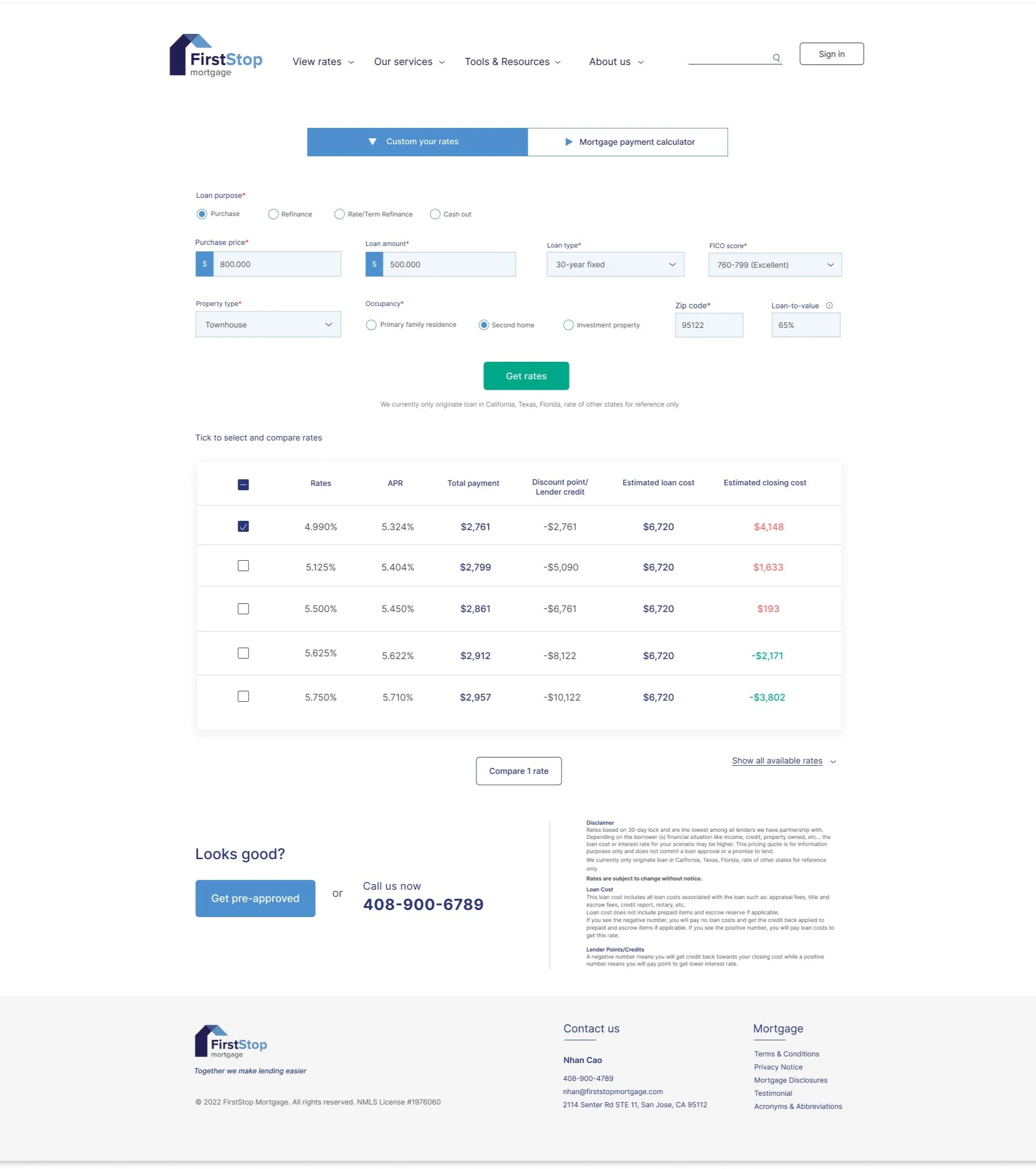
Custom your rates
This tool will be used the most for all types of users. The mortgage rates are different every day due to the market’s constant change so I want to ensure that there is enough information for users to fill in so the tool can give them the most accurate rates and the interface is simple and straightforward.

Results table
After users hit “get rates”, a list of results will show up in the order of low to high rates. There are also other elements that come with rates like APR, payment, estimated closing cost, etc. to help them pick a rate that works best for their budget.

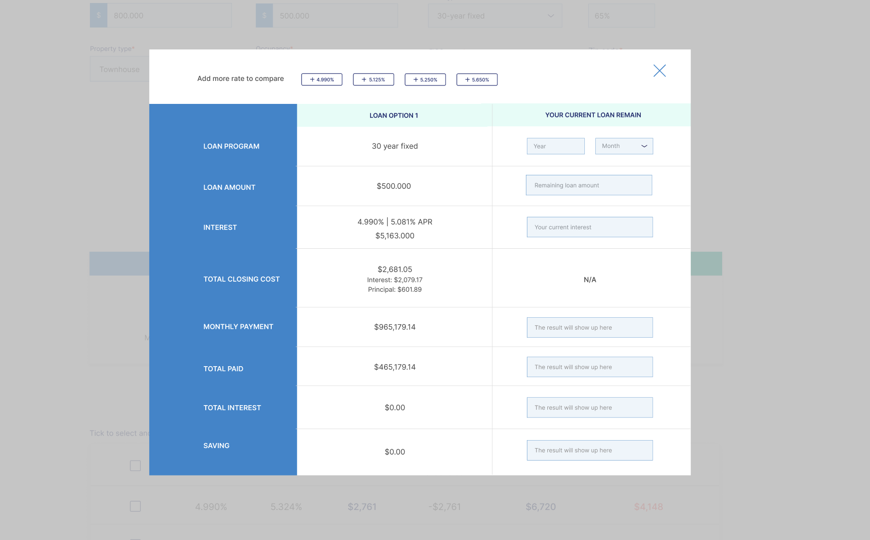
Rate-compare tool for refinancing option
Besides new customers, FSM also receives a lot of requests from the old customers for refinancing their mortgage. What they want to know and see is how much the new market rates can reduce their monthly payments with lower interests. This tool let them select more than 1 rate to compare with their current loan remain.
Usability testing
Participants
3 first-time home buyers and 1 loan processor.
The tests were conducted virtually.
Missions
1. For the customers: request a rate for new purchases with
$800k of purchase price and $500k of loan
Townhouse
As a second home
Zip code 95122
Excellent credit score
2. For loan processor: help customer request a new rate in task 1, then compare rates
Compare 1 rate of 4.99% interest
Then compare 2 rate 4.99% versus 5.125%
Feedback & iterations
After the testing sessions, I identified some patterns that I saw during the session then made iterations based on the feedback from the users.
1. Confusing buttons & inconsistency in UI components
Users mis-clicked the “Get pre-approved” with “Get rates”. This button is supposed to be the next step after the rate is selected.
For iterations, I removed it and left only 1 CTA on the page. I also changed the selecting dots to drop down items to ensure consistency on the form.

Before

After iterations
2. “How can I know which rate works best for me if I have no knowledge about mortgage?
The first prototype gave users a list of rate options but the first-time homebuyers don’t have enough knowledge to identify which option is the best for them. By adding the top 3 recommendations, users now understand the advantages and disadvantages of the selected rates. To avoid confusion and long scroll, all available rates only show up if they click the button.
Before

After
3. “But I don’t have these information. How can I continue proceed with requesting a rate?”
It must be overwhelming for first-time buyers to fill in information because there are so many industry jargons that they are not familiar with. My goal is even if the customers don’t know or don’t have some details, they should still be able to get the rates. The missing information will be auto-filled in order to generate the results.
For example, not many of customers know what a FICO score is and where to retrieve it, or what type of property they are interested in. Therefore, I added an “I don’t know” option in the drop-down menu. The results will show the general daily rates (like the one on the homepage) and let the users know that for more accuracy, they need to get this information and request a custom rate again.

4. Improve the design of rates-compare tool

The old design has an unfinished and it’s lacking of affordance and proximity between each input information. For iterations, I improve the visual by adding color for blocks and lines to separate each section. I also change from radio to rectangular button for adding more rates because per the feedback I received from the test, users didn’t expect they would be able to add another rate to the table by checking the radio button. Under the Current Loan Remain, Adding a pre-filled description in the text box helps explain where and what expected data will show ups.
Before
After
Success metrics


During 6 months in 2021, the old website reached a total of 2100 users of which 2000 were new and only 100 people were returning users. In over 4000 visits, only half of the amount requested custom rates from the website. The average time was over 2 minutes per visit. For an average website, this data is poor because the rule of thumb for an average small firm is around 1,000 visitors per month, but FSM could only reach 350 visitors per month in the first half of 2021.
Based on my research, mortgage customers prefer to call the office directly than browse the website so I don't expect the new website would reach 1,000 visitors per month; however, it's expected to increase the traffic by at least 30% and double the average engagement time. Longer sessions indicate more engaged visits and a higher chance of users returning to the website.
Takeaways
It was the first time I had a chance to work with a real stakeholder and a developer on the same project. There were some challenges at first because we live in different time zones so scheduling a meeting was not easy. Luckily, they were very patient and understanding so we were able to make it through.
This project requires a strong empathy with the users in order to develop a new solution.
I learned how to make the website informative yet easy to understand for the customers because the business' website needs to speak their language. If I failed in putting myself in their shoes, the same pain points would be repeated again, and the only difference on the new website would just be a more beautiful graphic.
Next steps:
- Continue working with the developer to make the new website functional and have any iterations if needed
- Continue to redesign refinancing and other pages
- Create different responsive screen sizes for iPad and 27" desktop screen.
- Have a pre-launch for the new website to discover some unforeseen issues
- Re-evaluate the website once the new website is completed