

Smart City CRM
Redesign the Action Today page for Smart City’s CRM
Their story
Smart City is an apartment locating service based in Texas. Their business is growing rapidly and they need a new solution for the Action Today page in their CRM to help agents to set up and manage 50 actions in one day.
My mission
I used to be a client of Smart City’s service so I have a well understanding of how the business and agents work. As a UX designer, I audit the old CRM to identify the areas that need improvement and give a full revamp to the Action Today page within 3 days.


Old
New
Unify the color system
Improve information scannability
Add new tools
Major improvements


Day 1: Understand & Identify

I and the Project Manager went over the prompt together. I understand that the goal of this new design is optimizing the efficiency of this page as much as possible. In this case, efficiency means:
How quickly the agents can look up the desired information
How they can see all important details in one glance
and how easily they can manage and make changes in the data


Other requirements include:
Set up daily reminders
Manage list queue of leads
Easy access to see all lead details (name, number, email, budget, city they are looking to live in, etc.) from the main screen.
Let the agent take and perform actions and make changes to their leads with the most efficiency
Mobile friendly if possible
Evaluate the old CRM Action Today page
I quickly heuristically evaluated the old CRM and identified the areas that need immediate improvements by using UX and visual design principles.
After studying the old design, I narrow it down to 3 specific areas in that I want to make major improvements because these areas have a direct impact to the agent efficiency
1. Icon usability
“A user’s understanding of an icon is based on previous experience. Due to the absence of a standard usage for most icons, text labels are necessary to communicate the meaning and reduce ambiguity.” - Nielsen Norman

2. Categorization tool
The color dots are unique to each agent as of right now and they use it as a categorization tool. For example, one agent can use the color blue for "this is an ASAP move" and another could use the color blue as "applied to a property, waiting on approval". I don’t think this solution is scalable and adaptive if they are expanding their system.

3. Presentation of information
Speaking from the visual design perspective, all of the information is very flat. Nothing sticks out to me at the first glance due to the lack of contrast and emphasis on the different types of information. There is also inconsistency in the way how the header and body text is displayed.
Day 2: Design
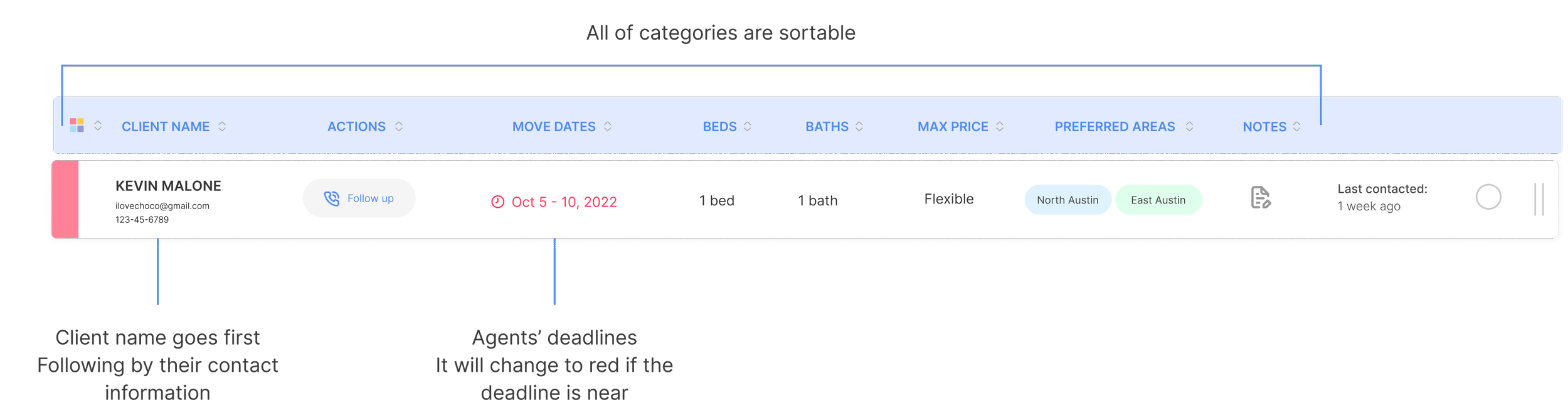
I’ve never designed or used a CRM before so I need to do heavy research about how it works and how the information is visually presented in other apps. To improve scannability for the users, each type of information in the table is highlighted differently, like using bold text, labels, icons, and items in the header are all sortable to give users the flexibility to search specific information.
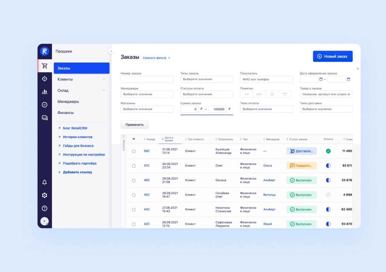

Retail CRM
HubSpot CRM
After identifying usability issues in the old and researching other apps, I’ve come up with better solutions to increase the efficiency for Action Today page.

Unify the color system
In the old design, the color dots have different meanings depending on the agents’ choices. It offers flexibility to the agents, but at the same time, inconsistency to the system. The company management is unable to track the status/categories of all the cases at one glance.
With the new unified color system, anybody in the organization can quickly scan and keep track of the status of the case on any platform. Unification improves efficiency and project management.

Improve the structural consistency and icon efficiency
In the old design, this action changes the alignment of the whole row - making all the information shift to the right. In this new design, the structure would remain the same no matter what actions the agents might take.
Recognition than Recall:
Labeling the icon will let people recognize information more quickly and correctly in the interface, rather than having to remember. We don’t want the agents, esp. the new ones, to guess the icons if they are not 100% sure. Imagine if they have 50 actions to take in a day...
Help agents keep track of their daily tasks with new add-ons

DAILY TO-DO LIST
This to-do list is a place for the agents to note down any detail information that is relevant to their today actions. It acts as a memory aid.

Preferred areas, last contacted, and checkmark
I used to use Smart City’s service before to find a new apartment in North Austin so I understand that preferred areas are must add-on columns. Some customers are very picky about this preference so this column will help agents come up with better results for their customers.
”Last contact” might be helpful for agents when they need to keep track of their last communication with their clients in order to set up the next action. Sometimes handling many cases might make them forget to keep clients an update
After finishing an action, agents can mark it as Done.
Improve information hierarchy and contrast
Day 3: Mobile version
One of the expectations, but not a hard requirement, in this design sprint is the new design that I just suggest needs to be mobile-friendly. There are not many mobile CRMs online for me to look at so I just follow my assumption and visual design instinct to create a mobile version that adopts most of the features from the desktop version.
Here is my quick take on the iPhone 13 Pro Max model.

